SPOC Automation
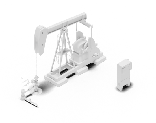
SPOC Oil and Gas
Our technology provides industry-leading automation for both the upstream and midstream segments of the oil & gas industry.
SPOC GRID Inverter Technologies
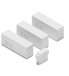
SPOC GRID Inverter Technologies
Our inverter technology balances power supply and demand for hybrid energy systems in grid-connected, off-grid, island and marine systems
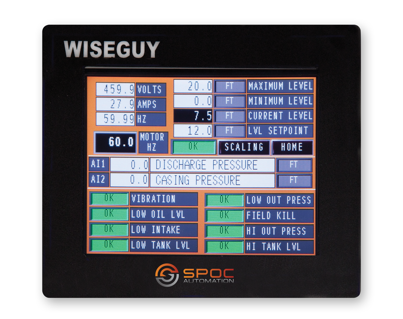
SPOC SCADA
SPOC SCADA
Our SCADA technology collects actionable data giving operators a clear vision of overall production from any internet-connected device.
Lift Up

Lift Up
Every company has a culture.
Our culture is built on innovation.
Learn how we do things around here.
Company